Helping a local hardware business develop its online shopping experience amid the pandemic.
Greenwich True Value Hardware
When the world shut down
Greenwich True Value Hardware (“GTVH”) is the only local hardware store in Greenwich, Connecticut. For years, GTVH has provided its customers with a personalized, one-on-one in-store shipping experience. GTVH offers its residents a wide array of hardware merchandise and specialty items most commercial hardware companies frequently sell out of. The pandemic forced Greenwich True Value Hardware to shut its doors for several months, ceasing all business and dramatically impacting sales. To fulfill customer satisfaction, Greenwich Hardware needs a way to continue business and sustain its high customer service ratings as the only local hardware store in town.
Greenwich True Value Hardware requires an e-commerce feature on its current website. This sprint aims to develop a mid-fidelity prototype of the added feature that effectively shows users how to browse and purchase items. Therefore, the homepage was not redesigned.
Role: UI/UX Designer
Timeline: 2-week individual sprint
Tools: Miro, Optimal Workshop, Maze, Figma, Slack
Website under construction
GTVH's existing website fails to offer an e-commerce feature, depriving its customers of the convenience of shopping online. I decided to visit its physical location to better understand the store's merchandise and customer behavior. By exploring the store's layout, observing customer interactions, and examining the products on display, I aimed to gather valuable insights that could help create the same shopping experience online, precisely the merchandise layout.
Making sense of the merchandise.
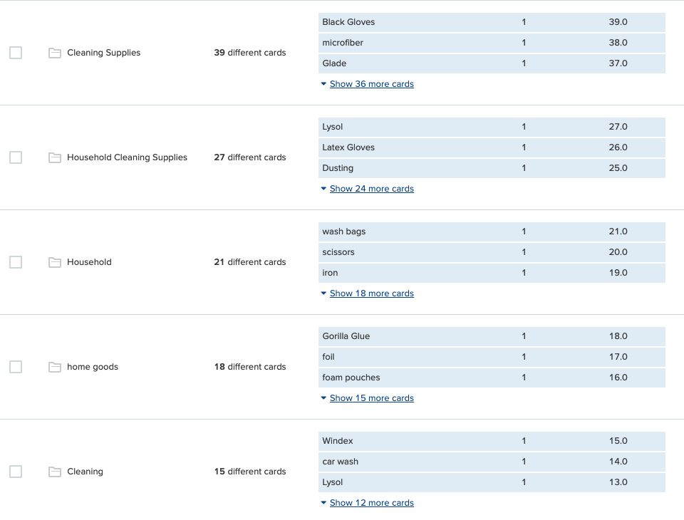
Organizing the store's inventory on its website proved challenging due to the large amount of merchandise. To help with this, I took over one hundred photos of the store's merchandise with the owner's permission. I then asked six people to sort the photos into categories they thought made sense and label them accordingly.
Card Sort Takeaways:
92 categories, with a median of 15 in each, were reduced to 7 categories.
The ‘Household’ category contained the most sub-categories


Despite being a small local store, GTVH's website should not represent something small. As it is the only local hardware store in town, and many surrounding local hardware stores don't have a website or e-commerce functionality, I decided to focus on larger companies to identify their features and what sets them apart.
Unsurprisingly, GTVH lacked the features of its larger hardware competitors. Home Depot stood out the most and became a source of inspiration for GTVH’s new feature. However, I needed to understand what users cared about before conceptualizing an e-commerce feature.
Same products, similar categories, but a noticeably different browsing experience.
Valuing customer needs both in person and online.
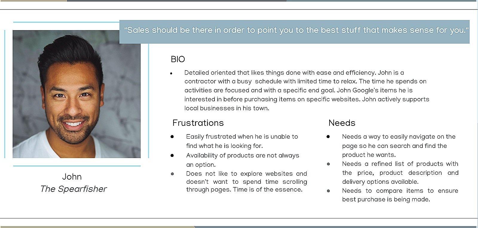
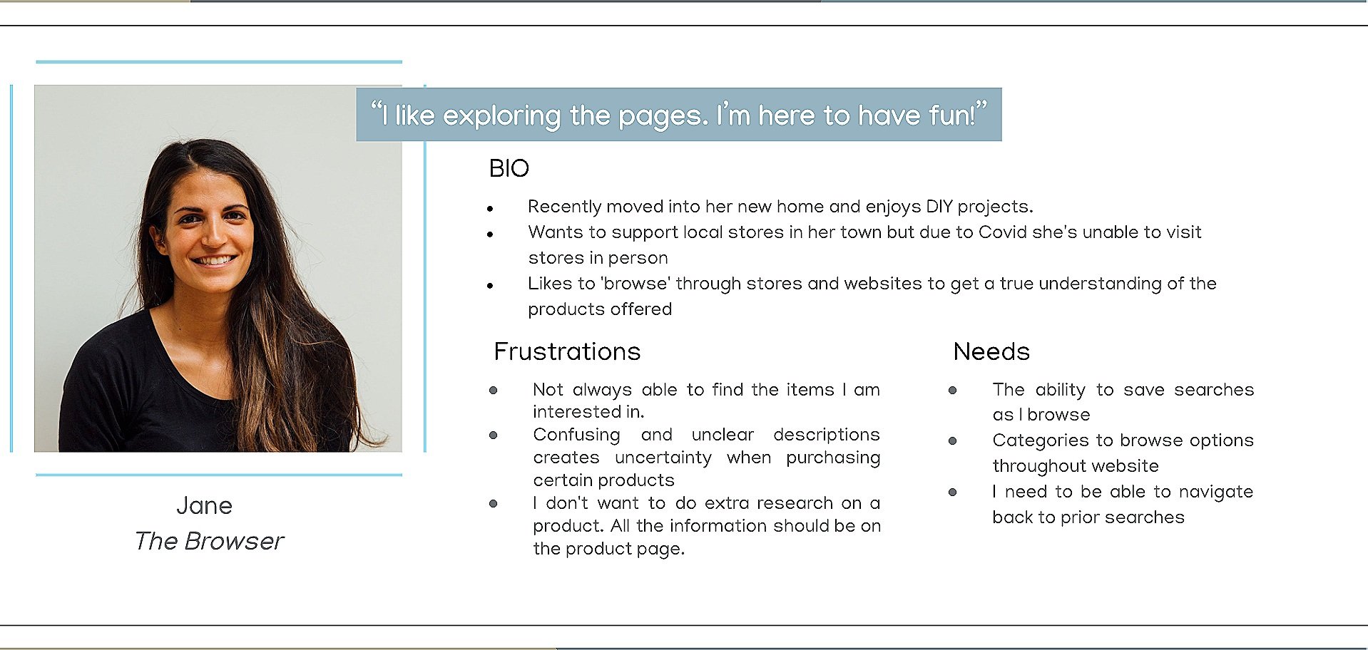
The affinity map data revealed GTVH’s ideal customers, so two personas were created: John, the ‘Spearfisher’ and Jane, the ‘Browser.’
Key Takeaways:
Easy and straightforward navigation without aimlessly searching for a product.
Ability to compare items to ensure the best purchases are being made.
View an item’s availability immediately and not during checkout.
The results of the competitive analysis provided valuable insights into the proposed e-commerce design. However, I wanted to gather feedback from actual online shoppers to better understand their preferences and pain points. My goal is to ensure that GTVH customers receive the same level of service online as they do in person.
5:
interviews
Users know what they are looking for and use the search bar to find products.
Users value customer reviews when deciding on an item they want to purchase.
Users value the option to view suggested items related to the product they are interested in.
Users need to easily find products without scrolling through multiple pages.
Users need a "Shop In-Stock" page for all available and ready-to-ship items.
Users need a clear one-page order summary page.


Turning ideas into drafts.
With enough research collected, it was time to design the e-commerce feature. The card sort provided me with ample data to construct the information architecture, enabling users to navigate the website with ease, as they would in-store.
Bringing ideas to life. From rough sketches to mid-fidelity wireframes to testing with users.
Five users tested the prototype and were asked to perform tasks to evaluate the feature's functionality. Their feedback was then collected and analyzed to identify areas of improvement and ensure that the feature was user-friendly and intuitive to use.
Key Takeaways:
Users found it intuitive, fresh and easy to use
Minor navigation pain points
Various UI modifications to the CTAs
Clearer language to improve ease of use
Final Thoughts
Since this sprint was focused solely on adding a mid-fidelity e-commerce feature, I could not address other features that could enhance the user experience. With more time, I would create a high-fidelity prototype and redesign the homepage for better usability.


