Developing a new innovative way to connect with customers after the pandemic. * Please note this was a spec project.
Neiman Marcus
Neiman Marcus (“NM”) is an American chain of luxury department stores representing the world's finest and most unique merchandise with a focus on the customer's experience.
Despite being one of the top luxury department stores, it has been facing several setbacks, such as filing for bankruptcy during the pandemic and its need for a digital transformation. In order to connect with customers, and foster the highest level of customer service while increasing sales, NM needs a new digital feature to boost business and remain one of the leading luxury department stores.
NM requires an exclusive premier-access subscription box service with specially curated items by a personal stylist for each customer. The aim of this sprint is to reinforce NM's brand and help it recover from its financial crisis.
Out with the old, in with the new.
Role: UI/UX Designer, Research, Wireframes, Prototyping, User Testing
Timeline: 2-week team sprint
Tools: Miro & Figma
How do we help Neiman Marcus out of its financial crisis and help them evolve into a more digital business through a new in-app feature?
You can count on the clicks.
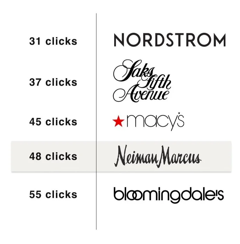
We started our research with a task analysis on five luxury department stores’ iOS apps focused on completing a purchase. The analysis revealed that NM requires more clicks than its competitors. This insight focused our attention on significantly reducing the number of clicks a customer needs to perform within the new feature resulting in an improved user experience and customer service.
“We are shifting from a transactional economy to a relationship-driven one. A subscription is a recurring touch point with the customer. It’s that constant reminder that people have a relationship with the brand.”
— Adam Levinter, author of “The Subscription Boom”
Focusing our attention on the features that actually matter.
In addition to our task analysis, we learned that most transactional companies are shifting to subscription-based services. I therfore shifted my attention to pinpointing five comparable clothing subscription services that focused on the attributes users care about the most: pricing, returns/exchanges, and the number of designer brands to choose from. This helped inform the key features of the NM subscription box service.
The features that’ll make a difference to our users.
A wide array of designer brands to choose from
Enhance the overall online & customer experience
Improve customer service experience
Free return shipping from home
Personal Stylist
Flexibility
“If you could change anything about the current subscriptions you are subscribed to, what would they be and why?”
So what did the users say?
We interviewed six participants to gain a better understanding of how people interact with online shopping and subscription box services.
Understanding the customer was our top prioroty and our focus was to evolve NM into a more relationship-driven service.
We developed an affinity map from our interviews that helped us uncover insights to develop our primary and secondary personas.
Meet Jennifer, the primary user of our subscription box.
Jennifer’s needs and pain points:
Remove and/or limit the guesswork out of shopping
Value a service that is personalized to her
Wants to look and feel good in trendy clothes
Need for a professional stylist to keep her informed on new trends
Derika, the secondary user gave us different yet valuable insights that also needed to be addressed.
Derika’s needs and pain points:
Easy returns with transparent policies
Save time on shopping
Easily overwhelmed by so many styles to choose from
A second opinion while shopping to boost confidence before purchasing
There’s an opportunity to offer customers exclusive windows to view and purchase new luxury items, thus retaining happy, loyal customers. As well as take the guesswork out of shopping, thus freeing up valuable time for our customers.
Our research resulted in useful information but we needed to drill it down even more. We went back to our research and interview findings to help further define the features that matter the most in order to help distinguish the needs of our users. As a team, we developed How Might We Statements to determine where our focus should be as we moved into the design phase of our sprint.
HMW make the return process convenient?
HMW offer a valuable feature or experience for our customer?
HMW help our customers feel better about their individual tastes?
The HMW statements revealed three insights:
preferences and options that allowed customization of wardrobe
subscription service that recommends new clothes based on the newest trends & preferred styles
a hassle-free way to return clothes
And the shopping journey begins.
We developed three new user flows with the goal to keep the experience as streamlined as possible with minimal clicks.
An onboarding flow to help inform Jennifer of the new feature. Throughout this flow Jennifer will learn what’s inside the box, the perks, and a fun and quick style quiz.
New subscription box flow to successfully subscribe to the new service.
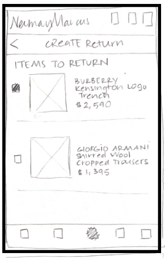
Returns flow for easy and straightforward returns without any hassle.
Styling our new feature.
We were mindful to retain Neiman Marcus’s current design style & layout as we integrated the new feature into the app. Some things we kept in mind as we began designing:
iconography
typography
photography
style guides
*Current NM mobile screens and photography
Our style guide stayed true to the NM brand.
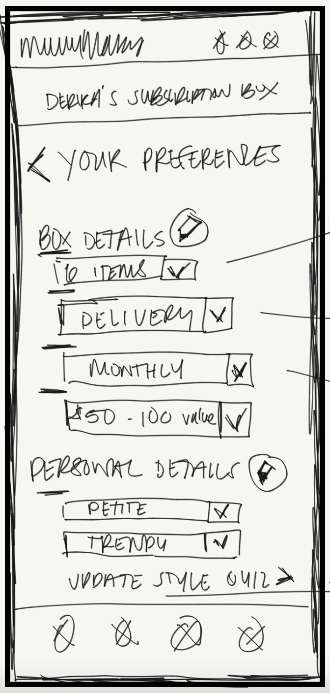
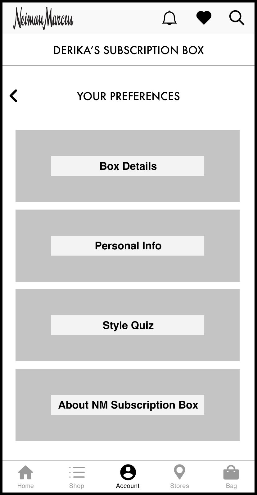
Turning our sketches into wireframes.


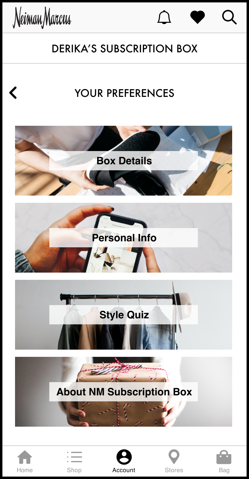
Testing our prototype with users to help validate our assumptions.
The first round of usability testing revealed our users pain points and roadblocks while navigating the prototype.
One key takeaway was to make the new subscription service more visible on the home page.
We conducted the second and final usability test after iterating on our design and asked our users to fill out a SUS survey at the end. Our final design earned a score of 87% / excellent rating.
The initial homepage (left) did not have any information on the new subscription service. The user had to click into their ‘Account’ to learn about the service. This ultimately led to more clicks. We fixed this by creating a new section on the homepage (far right), making it more visible and with fewer clicks.
Next Steps…
Improve integration within the Neiman Marcus ecosystem, including their InCircle Loyalty Program.
Algorithim implementation within the interface
Marketing and testing of a subscription feature name


